The project
As the lead designer on this project, I was responsible for creating the process in the first place, planning and delegating tasks, facilitating user research and approving designs. However, considering the size of the project and the fact that our team was small (and the fact that I actually like to design myself too 🙂), designing certain features was also part of my job.
How to keep a business application simple without losing functionality?
Setting up an organization's entire phone system and reachability is a big responsibility and can be a quite challenging task for users who aren't necessarily tech-savvy. Furthermore, business applications are often created to contain as much functionality as possible without a lot of regard for usability.
We embarked on a journey of looking into that problem and resolving it by creating a user-friendly dial plan editor for organizations.
The process
Looking at what we already know, what we think we know and what we don't know
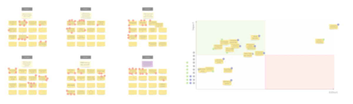
In order to start the project, we had to conduct an initial user research with the goal of finding their pain points during the setup of an organization's telephony platform, and in particular, of the call routes.
We talked to 4 companies and within that with 4 different users. The workshop tried to find out how they worked, how they used their telephony system and how they used the competitors' applications.
I facilitated a workshop with the team. The first part of the workshop was to come up with solutions for HMW problems. We then voted for each solution and included the top solutions per question in the impact/effort map. As a final step, the Product Owner decided which of them we were going to build. We have decided to focus on 3 main issues.
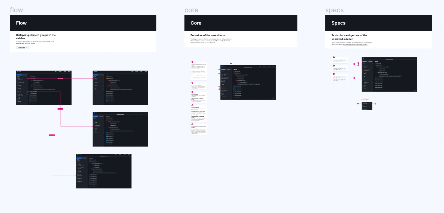
From wireframes to prototypes
After the pretty long discovery phase, we could finally start creating something tangible - wireframes. We used them both in the refinement session with stakeholders to collect input from other teams on things we might be missing, and in user research to validate some of our decisions.
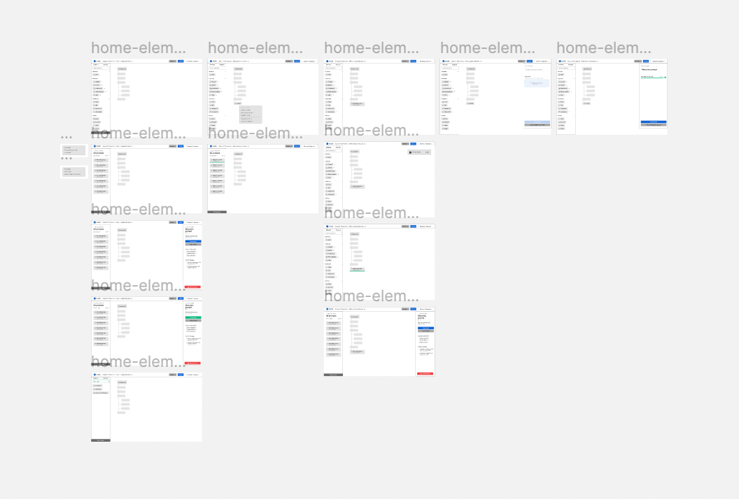
Addressing the input from both sides, we created improved wireframes and started with the high fidelity prototypes. Since some of the decisions were made only in the prototype phase, we wanted to validate them one more time with users to test the hypotheses we were making. By the time we were at the last step of the creation process, we were reasonably confident to make the design handoff for the development.
Test, validate, iterate, repeat
As no design process ends with the handoff, our process didn't either. Every time a feature is developed, we do design QA before it get handed off for code review and testing. We had multiple moments where we validated the application from the user perspective before and after its release, and we have been collecting and sorting the data from the support team in order to make a case for future iterations.
The findings and conclusions
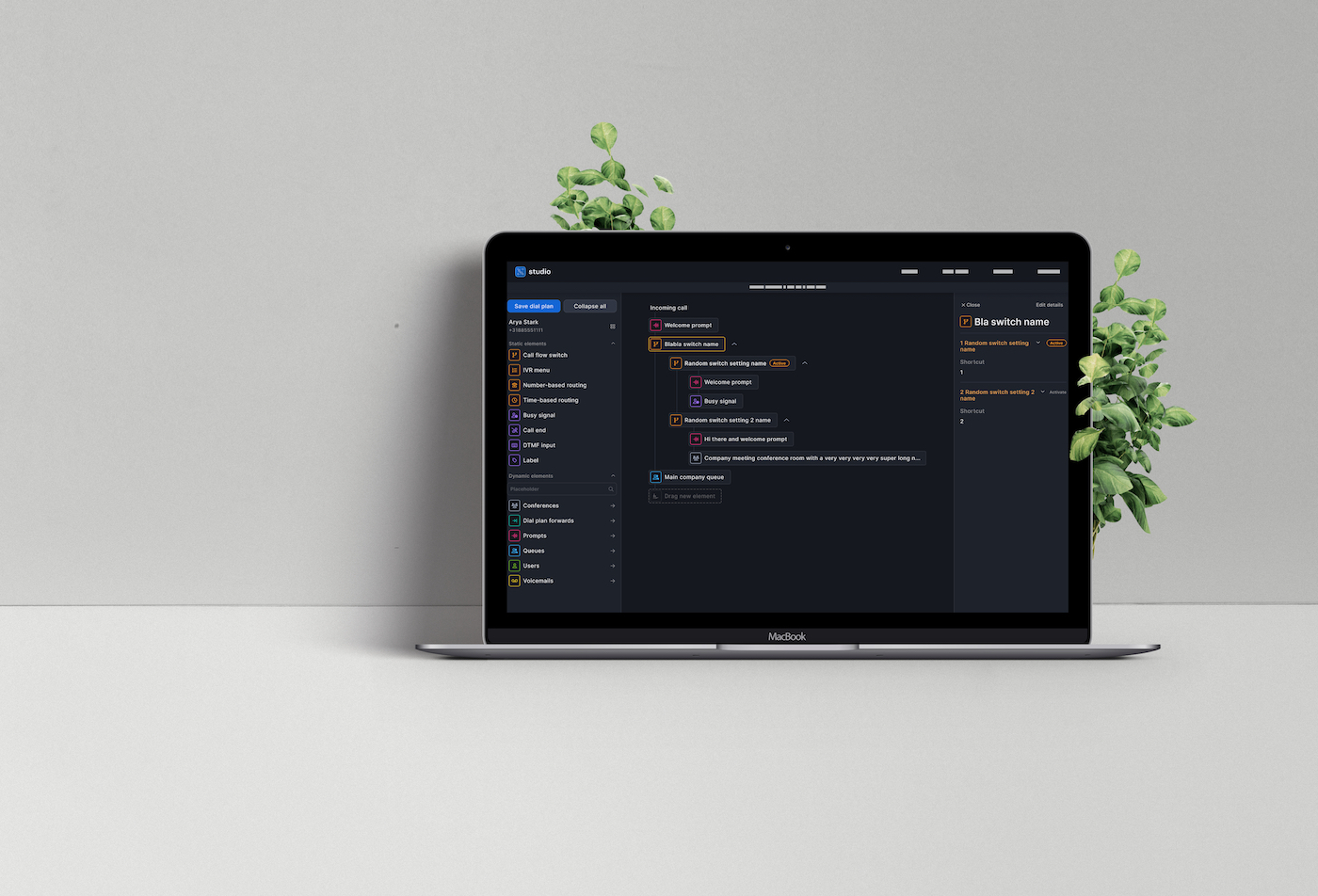
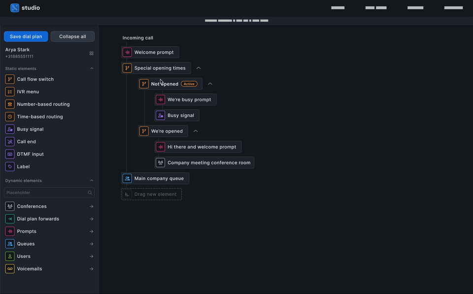
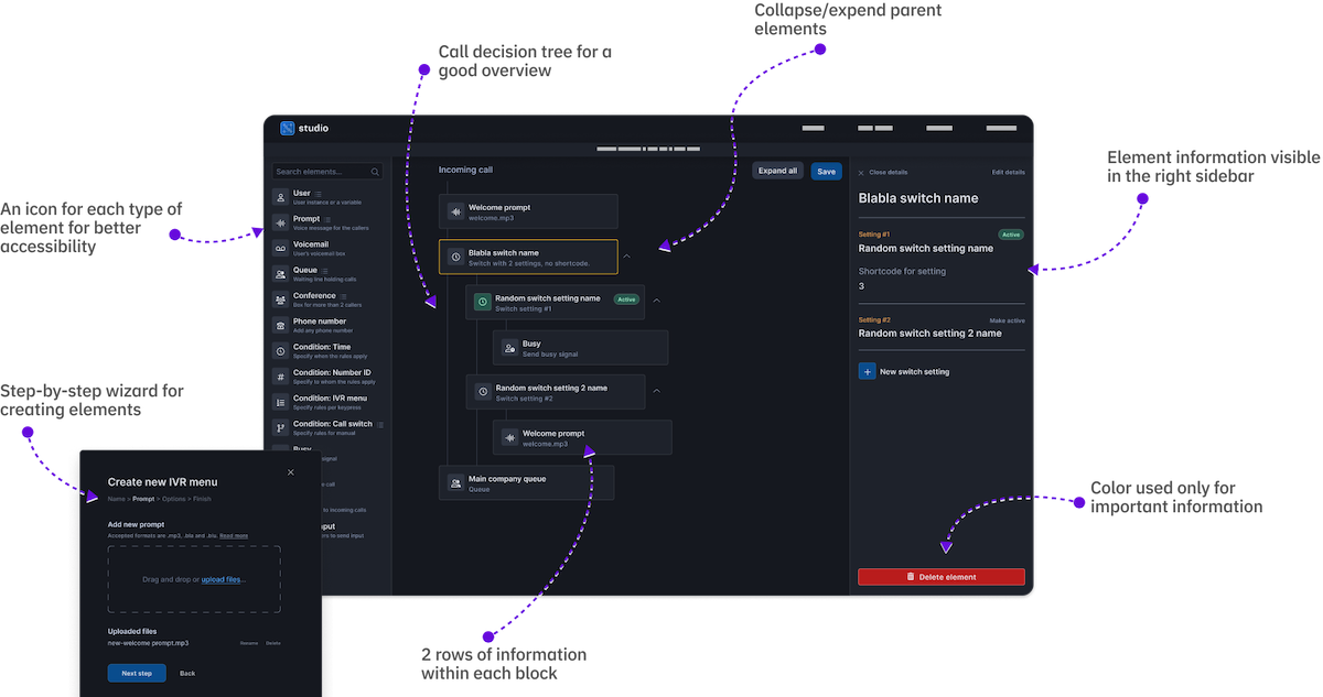
When we started with the Studio project, we had three main ideas; (1) to create a visual dial plan editor with blocks so that the users see it as building blocks of their call route, (2) to use color only sparingly, mostly just for communicating very important messages to users and avoid burdening them with sensory overload, and (3) to, unlike most other business applications, use white space to provide a better overview of the dial plan they are creating. In the first tests where we were showing the users prototypes, they seemed enthusiastic about all three ideas.
However, when we talked to the same users after the feature went into production, the first idea was a hit, but the other two needed some tweaks.
Speeding up workflow with colors
While they originally supported the idea of no colors in the user interface, it became clear that the users needed a bit more time to recognize different elements in the list if they were relying only on small icons next to the element's name. While the choice of icons over colors was a conscious decision from our side to support inclusive design, we decided to experiment with adding a bit of color next to the icons.
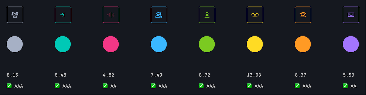
We wanted to go for AAA compliance (the gold standard) according to the WCAG accessibility guidelines for each color, but since we needed eight colors that can easily be told apart from each other and are not mistaken for another semantic color in the UI (for example, the error red, the success green or our blue CTA color), that requirement wasn't feasible and we opted for an AA level instead.
Rearranging elements for a better overview
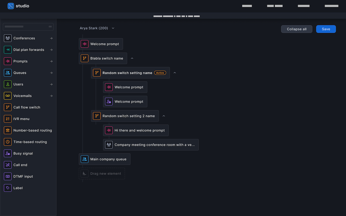
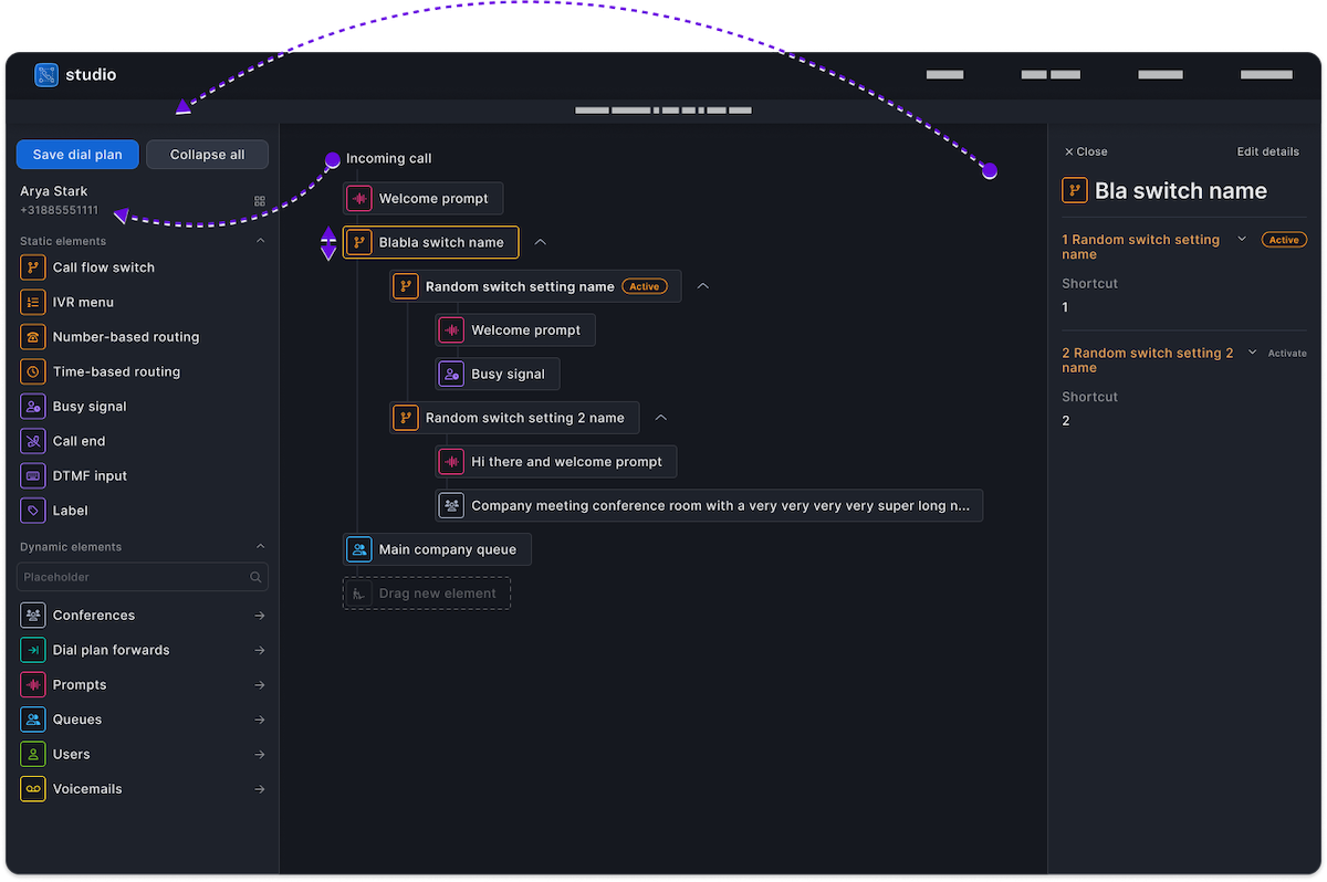
Our clean and elegant dial plan editor had one more issue which shone through in the post-production tests; the arrangement of the elements and white space prevented the users with big dial plans to have a good overview of what they were doing. In the original design, the user's name and number were placed on canvas, right above the first executable element. The reason for that was to intuitively connect the dial plan and the number it belongs to. Furthermore, the button to save the dial plan was also on canvas. In our tests, where users had long dial plans and would get distracted for a minute or two during the process, they lost the overview of whose call route they were managing. The save button was also hidden at the top of the screen.
For all those reasons, we decided to cut the white space to make more elements visible, and to place both the number and the save button in the left sidebar where it would be fixated when a user scrolls.
After we gathered insights from usability tests and user interviews, it was clear that both tweaks improved the comfort and speed at which users operated the interface.
What we learned
Nothing replaces a real-world environment for testing.
Despite the fact we brought the stakeholders in early and talked to them on multiple occasions before the launch, we still had a few insights in the post-production tests. This way, we got to react very quickly to real-world issues that are sometimes difficult or impossible to collect in staged environments.
Test often, test early.
We conducted many different user tests and interviews, and we collected a lot of valuable input that contributed to the users being happy with the product today. Next to that, we managed to build a relationship with them where they feel included and heard, resulting in more cooperative communication.
Next steps
The currently released version of the dial plan editor has been well-received by our customers. However, there are some improvements that can be made and that we have on our horizon. A dial plan editor should be able to handle more tasks that the company administrators have, and help them switch between those.
I believe we made very successful first steps of making call routing more accessible to a wider range of users and companies, while treating it as a separate application in a telephony platform.