My role
My job was to redesign a contact centre application entirely. Since I was the only UXer, I did all the research, workshops, design and UX copy myself.
The process
The first thing I looked at was who our users were. There were two different groups; corporate contact centers and out-of-hours GP services. My first step was to talk to both of them and observe how they work.
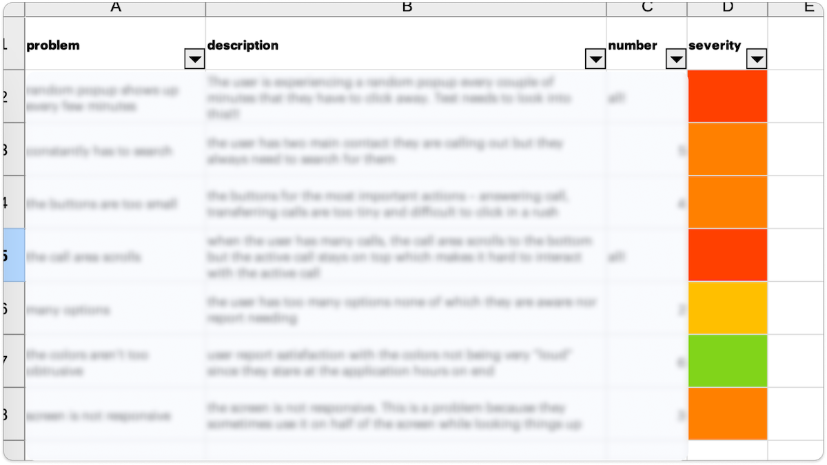
I have collected and analysed the research findings in an Excel sheet. After that, the clustering of the pain points took place as a result of which we had six main categories that needed to be seriously reconsidered.
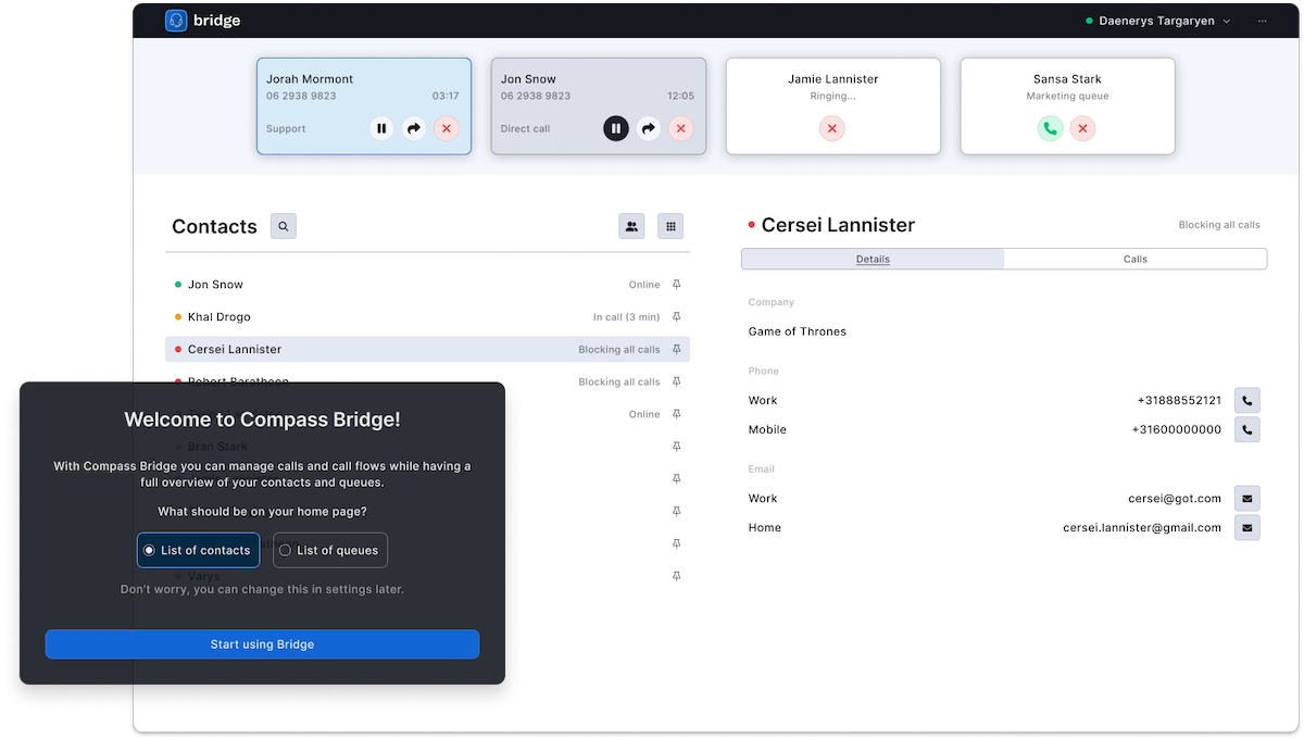
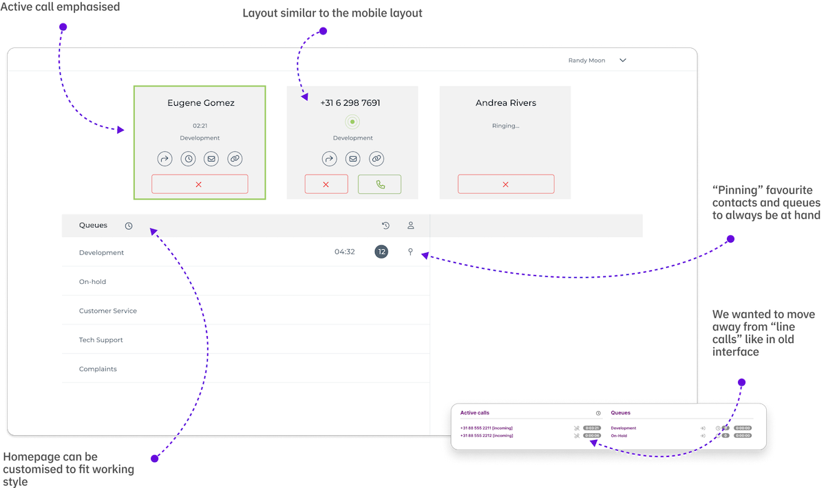
I started by sketching and wireframing some ideas and flows I had in mind. The main idea I wanted to explore was to have two different home pages, one for each user group.
We went back-and-forth talking to the users and testing the concepts until all the design decisions were verified. Ultimately, we went to test a high-fidelity prototype that, since it scored high on usability testing, became Bridge 1.0.