Character and values
A communication company whose some of the greatest assets are the knowledgeable team and the culture they have created. Despite being a business-to-business company with niche products, they wanted the brand to have a serious-but-quirky character.
Next to establishing the character of the brand, it was also necessary to determine the values that make for the organization's high-level decisions. Here are a few that were important to consider during the branding process:
- Bold but sensible – Technical expertise is the start of everything they do; they are a knowledgeable partner with a lot of technical knowhow. They’re confident and have their own take on things, but they never lose sight of the needs of others.
- Flexible but reliable – They pride themselves in the ability to quickly adjust to new conditions and provide the best solution for customer needs, without compromising stability of the platform.
- Digital but human – Their fun character is part of their DNA. Because of their passion for what they do, they don't do boring or average. They have a spark; and they bring the weather with them.
Brand assets
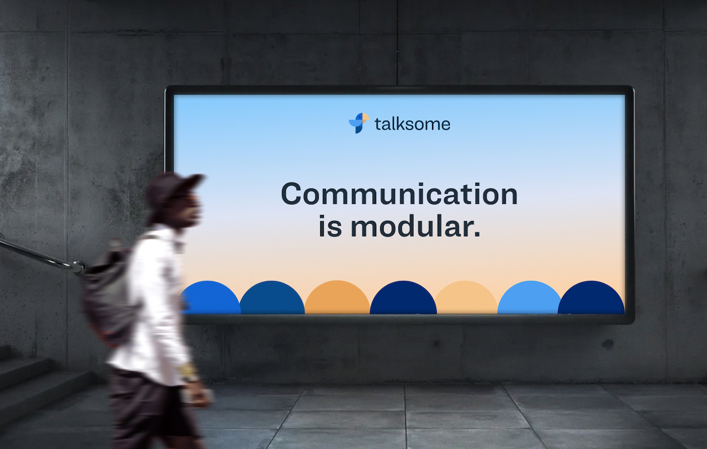
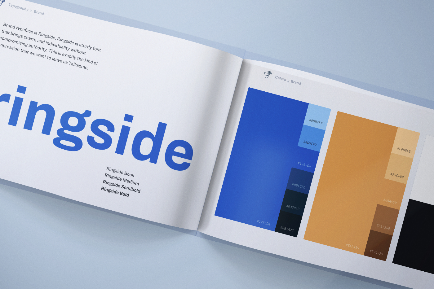
Color palette
After a lot of experimentation, we settled on blue and orange as main colors with an extended greyscale palette. Blue is the main color as it highlights the technology and "serious about work we do" attitude. Its complimentary color orange represents the enthusiastic, warm and human side of the team.
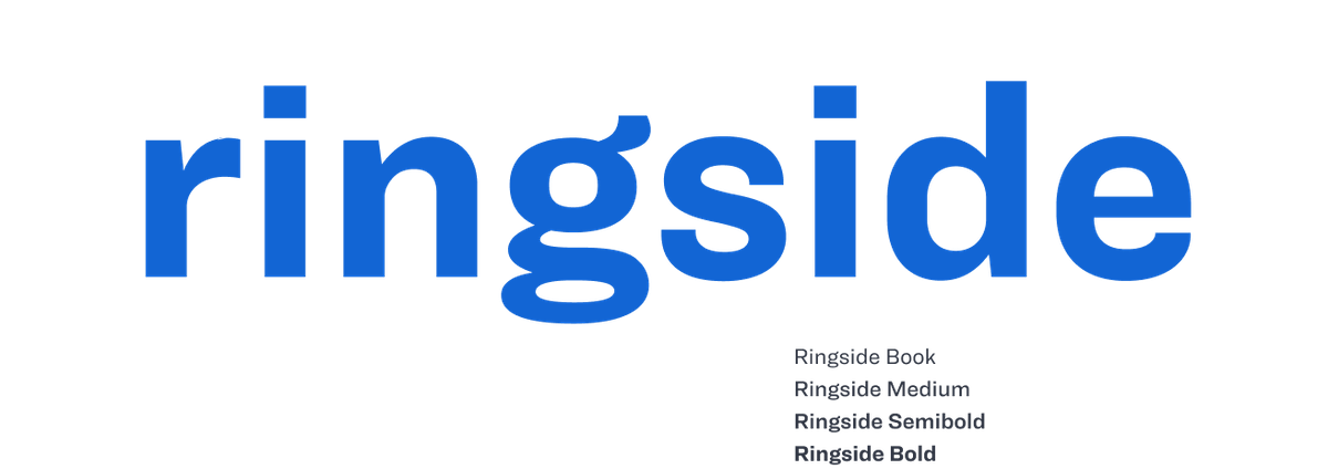
Typography
Being a communication company, the choice of typography was very important and the requirements were extensive. Among other things, the typeface had to be very legible, it had to look modern and slightly quirky. Finally, we wanted the typeface for both headings and body text to make it easier for the team to implement the branding everywhere.
We chose Ringside to be the brand typeface.
Logo
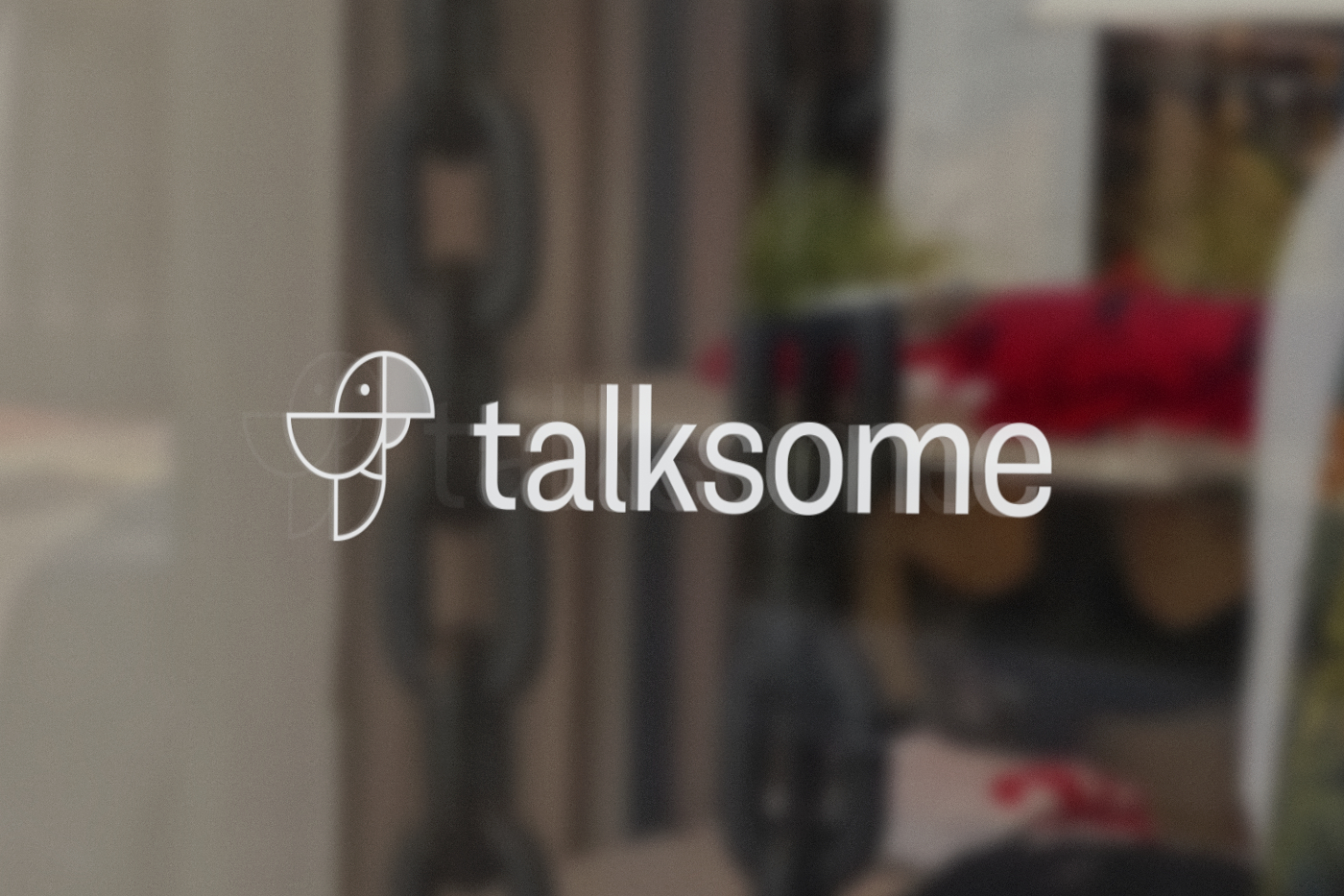
I created the logo having two main things in mind; it's a communication company and they create modular solutions. Hence, the logo is a parrot representing speech, which is all made out of semicircles that illustrate the modularity.
How it all ties together
After all assets were in place, one of the first tasks was to create a brand guidelines book that encompasses and explains the direction of the brand.
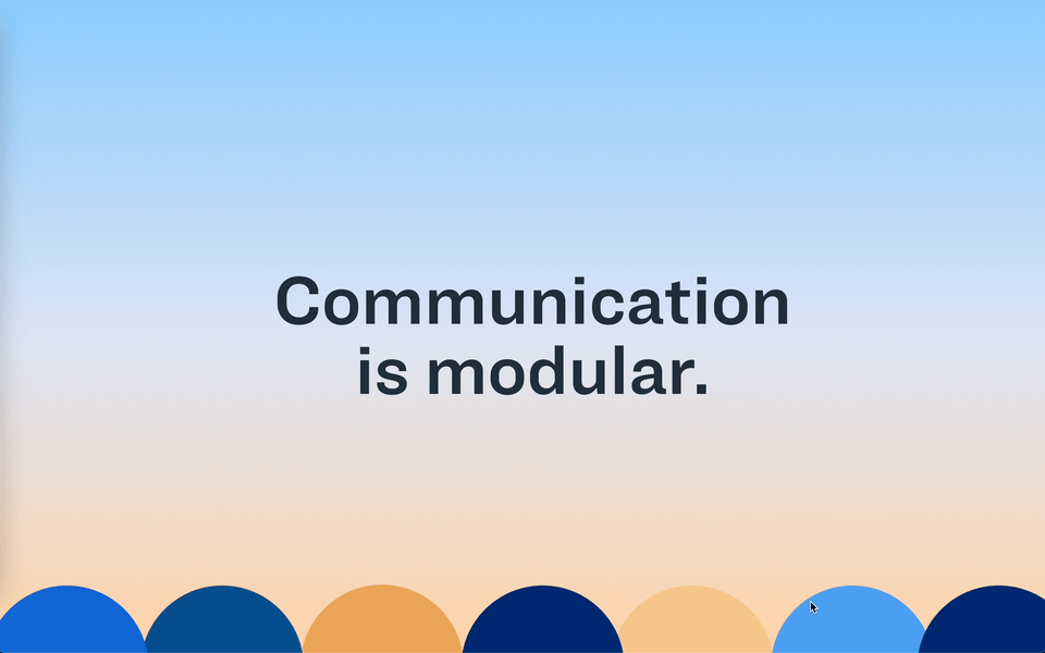
The high-tech is represented with the darker, more elegant look, while the quirky hand-made illustrations soften it. I opted for the strong contrast between colors and font sizes to communicate messages as clearly as possible. The images were all custom-made and are strategically placed to support the message in the surrounding paragraphs.
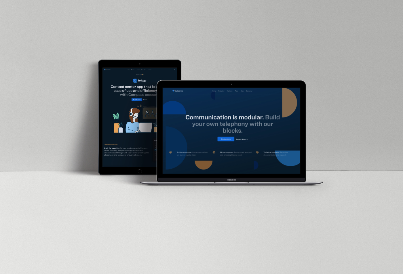
Markdown is one of the most popular markup languages for almost anything in tech companies today, so I manually created a support and documentation website with a static site generator [SSG] called Jekyll. Any change can be easily published directly from GitLab with a simple merge.
Final thoughts
We wanted to create a brand that breathes technology and warmth. Although at first glance that might seem irreconcilable, I believe we managed to achieve a professional look without seeming corporate and unimaginative, with an ability to scale and develop as the company's needs grow. The clients have had nothing but positive remarks about the new style.