For my current job, I had the pleasure of reviewing many CVs of people that would potentially become a part of my team. I noticed a trend that, frankly, I'm quite judgemental about – using progress bars to display skills.
You might be wondering why does such a small design choice invoke a strong enough reaction in me to write a blog post about. The reason in my eyes is quite simple; it's an incorrect design choice made in an application for a position for making design choices. Even more importantly, it's a choice that prioritizes a form over function – something that should never be the case in a proper product design.
What are progress bars anyway?
Dictionary.com defines a progress bar “a graphical element that illustrates the percentage of a computer task that is complete”. So to simplify; it’s a graphic that illustrates how complete a task is. How complete. Complete. (I’m trying to simulate echo here; just in case this wasn’t clear enough.) This is the keyword that makes progress bars unusable in the context of skills.
But first, let’s have a look at how they even look like:

They consist of two main elements:
- a bar that shows what “complete” means, and
- a bar that shows what is the current status of a task.
Why you shouldn’t use progress bars in your resume
1. Skills are not finite.
I’ve already mentioned this a few times, but let’s say it again – skills are not finite values. There is no 100% of a skill. I am fluent in Croatian because I was born, raised, studied and lived there big part of my life, but I wouldn’t even think of saying I know 100% of the language. I’m not even sure how I would define knowing 100% of any language. There are so many dialects, historical constructions and slang words that I wouldn’t even know where to begin. There is always more to learn, that's the beauty of skills.
Considering skills finite tells either:
a) that you have poor analytical skills to not notice that skills can never be complete,
b) that you're not curious enough to notice that skills can never be fully learned, or
b) that you are hoping I will not notice this and be impressed with your (almost) perfect skill level.
2. You are probably overestimating your skills.
Consider this image for a second:
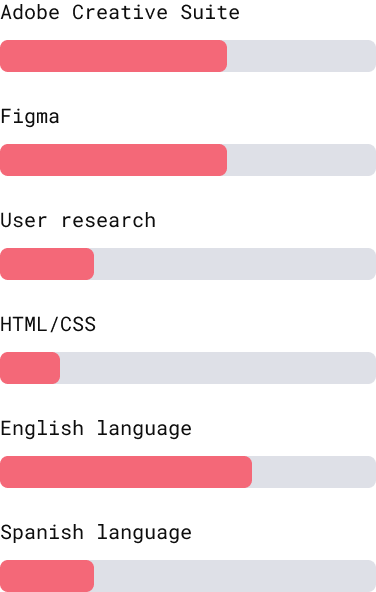
Would you ever apply for a job with skill levels like shown on the image above? Probably not because it looks as if you’re applying for a job that you are simply not trained for.
This means you will feel the urge to make it look better and will therefore overcompensate. You will drag those bars all the way until the almost-end to appear more qualified, and this will, once again, be wrong information you are putting in your CV.
3. I don’t know how your measurement system converts.
Any language has a relevant and agreed-upon system for measuring skill levels. And they, for a reason, don’t say “complete” or “perfect”. If you say you are fluent in English and know Photoshop on a professional level, I will know what to expect from you when you come working with me. I will know that this means I should be able to speak normally English to you in work environment, without too many obstacles, and I should be able to give you a task to edit something in Photoshop without having to walk you through it first.
If you say you know English 65%, I have no idea what to do with that information.
How to use visual elements in your CV?
Okay, let’s say I have convinced you that progress bars might not be the best choice to present your skills in a CV. Now you're faced with the issue of a boring-looking CV. What can you do to make it look more attractive while not compromising the message?
1. You can use progress bars for education.
Your education can be completed or almost completed and you can use this to add a visualization in your CV. Are you in your last semester of your Master’s degree? That’s great, show that off with an almost-complete progress bar.
2. You can use progress bars for courses.
Do you like taking lots of (relevant) online courses? That’s a great thing also for a recruiter to know because it shows you are proactive and you like to be up-to-date in your field. The courses are finite and it’s okay to celebrate if you have completed them by making them stand out in your CV with a nice progress bar.
3. Show off your skills as separate blocks.
Okay, this is technically not a very visual way of displaying information, but it does break a bit the plain text. What I mean here is something like this:
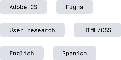
Display the skills you are comfortable with and just ignore the levels all together. The levels are artificial anyway.
Conclusion
You should take your CV seriously and consider graphical elements that you place in them just as seriously as you would consider the words you use. When you have an idea of the content you want to put in your CV, stop for a moment and think what would be the best way to communicate that content to the person who might be reading it.
If the position you are applying for is design, then make sure you think about it extra carefully because communicating information is your job.